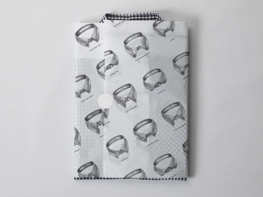
New packaging was needed for Ben Sherman. I chose a clean, confident tone, without taking over from the product it would be containing. And it needed to complement the new interior identity being created in parallel. A warm white was chosen throughout, with graphic elements in a light copper foiling - referencing the look of a tarnished British copper coin.
Each item featured an embossed ‘button’ to further reinforce the core brand elements of the clothing ( the button-down shirt ).
The ‘Shirtleliers’ were provided with their own calling cards to allow for clients to contact them should they need any further advice, but also to enhance the personal nature of the customer experience.
Special flat draftsman pencils were created, both for use by the store team, but also as giveaways for customers.
A hand embosser was created so that each receipt, once checked, was stamped - creating an impression of the button on the top of each receipt. This was to give a sense of finality and closure to the encounter - a full-stop to the experience. It would also be a nice detail to discover on being handed the receipt.


