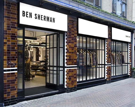
Ben Sherman’s Carnaby Street store is steeped in history for the brand. It was first opened in 2002, when the brand marketed itself fully as a ‘Mod’ brand. Carnaby Street was a natural home for the first retail store. However, it was in dire need of a refit. It looked tired, derivitive and had become almost a ‘pastiche’ of the brand. But any refit needed to bepart of a holistic brand-wide change to truly benefit.
Collaborating with award winning design agency BRINKWORTH, to bring it all together, this store’s new concept and eventual refit was totally immersed in the parallel rebranding process that I was undertaking at the time. So this was one of the first big gestures that heralded to the world that Ben Sherman was changing.A new concept for the brand needed to be created which felt ‘honest, down-to-earth, British, modern and stylish’. Tired mod clichés , parody and pastiche were to be avoided. Nothing was to be self-conciously high-concept. This had to be a solid statement. And it had to feel like ‘Ben Sherman’.
The final interior experience
Buildings and interiors from around Clerkenwell, ( the region in London where the Design Studio is based ) were looked at. This area is full of old industrial warehouses, with beautiful dark brown and white ceramic tiles used in the interiors and exteriors.
Mid 20th century furniture was referenced, the visual language of traditional butchers shops and delis, vintage British cafes and even the London Underground ceramic architecture.
Contributing Skills
Conceptual Co-direction / Brand Identity / Brand Ideology / Art Direction / Visual Identity / Creative Layering / Copy Writing / Tone-of-Voice


