Concept Co-creation | Stills Direction | Campaign layout
Concept Creation | Creative Direction | Music | Storyboard | Stills Direction
Infinity is a successful brand of medical apparel in the US.
It was looking tired and unfit for purpose. So a total rebrand from product to identity was undertaken.
We repositioned Infinity as a vibrant, active and athletic-adjacent brand, to attract a younger, and more contemporary customer.
The launch film, “Go The Distance” was created to root the consumer into a relatable day, from domesticity and family through to heavy, physicals on-shift dealings.
Concept Creation | Creative Direction | Branding | Film Editing | Sound Design
CASE FILM
A new identity was created for the brand INFINITY, a successful brand of medical apparel in the US. A full rebrand of identity, logo color palette and photographic, filmic and visual style was undertaken. Packaging Design was created in parallel.
Concept Creation | Creative Direction | Music | Storyboard | Stills Direction
Concept Creation | Creative Direction | Music | Storyboard | Stills Direction
Concept Creation | Creative Direction | Music | Storyboard | Stills Direction
A medical house of brands in California had acquired several brands that had no distinctive differentiation or identity.
This project was to define those brand values and rule, lay them out and create an online live portal.
I have composed and produced music my whole life.
Often I have used this to create mood soundtracks for various seasonal brand films. Here are some of them.
Concept Creation | Creative Direction | Music | Storyboard | Stills Direction
Concept Creation | Build | New Transfers
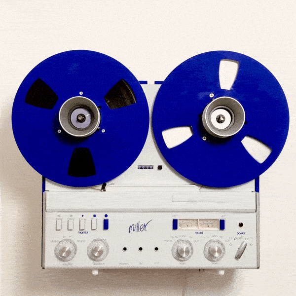
I have always loved the kinetic quality of reel to reel players. The deliberate quality of deciding to put on a tape and not easily switching it to a new tune.
I also love International Klein Blue - so I could not resist that color combination.
Concept Creation | Creative Direction | Music | Storyboard | Stills Direction
The Portobello store in London’s Notting Hill was to be treated differently, visually, to the other main stores. It was much more boutique and esoteric and was treated as a local store to the area.
I created a treatment strategy for the 115 Portobello Ben Sherman store, which allowed it to become a vehicle for lots of fluid, creative ideas to flourish.
So creative concepts for windows and other promotional devices that would be deemed possibly too risky, difficult or confusing for the global brand as a whole, would have an outlet through this one-off store.
These projects were, quick, loose and had very little time built in to create or to stay exhibited. They were to have a fun, sketchy quality and did not take themselves too seriously.
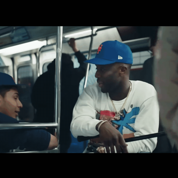
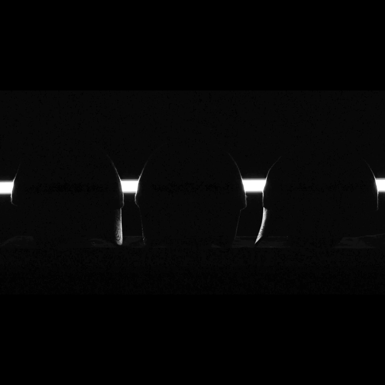
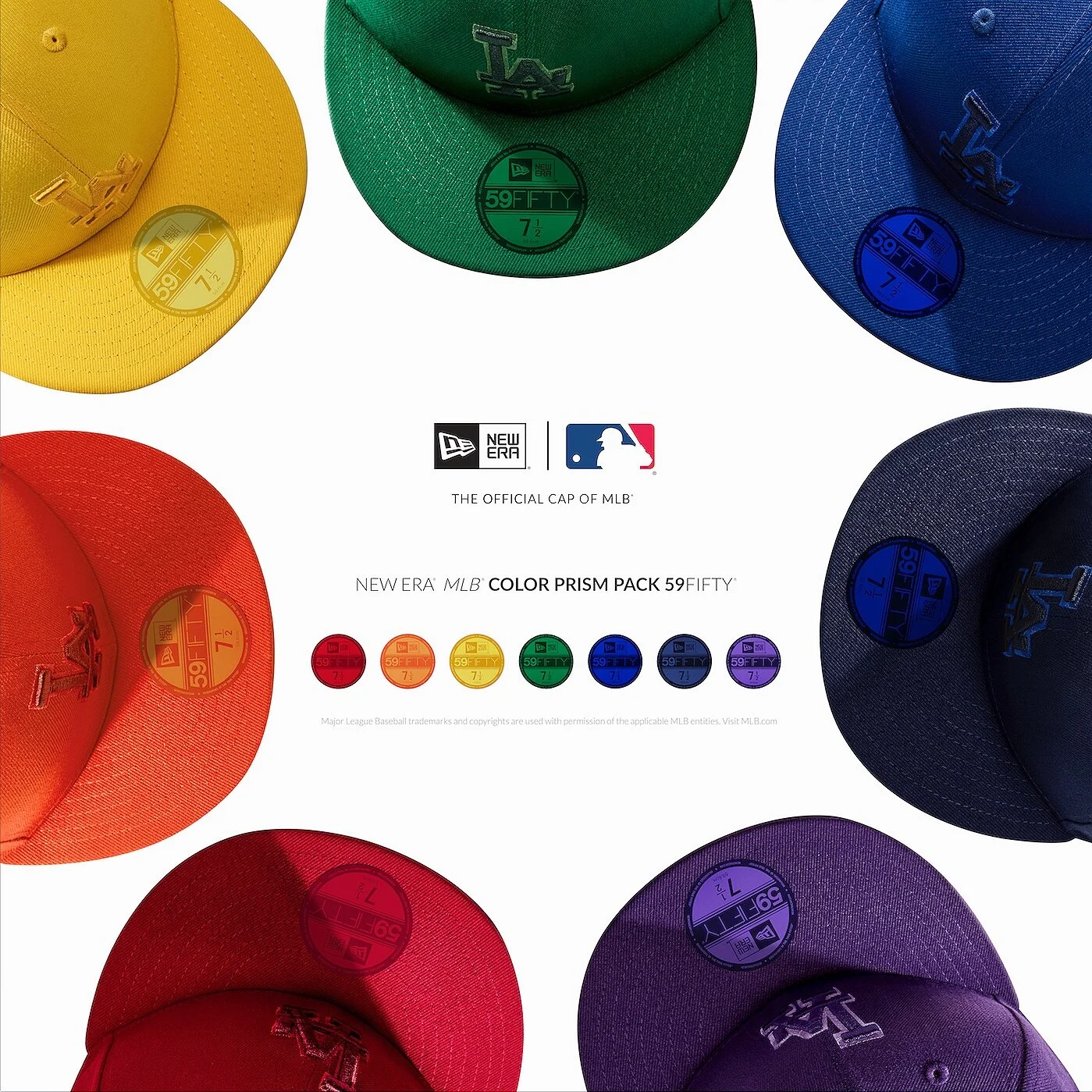
New Era Cap celebrates 100 years. So a film is made to tell the story.
I created a treatment and script strategy and shaped the look, tone and art direction.
.
Concept Creation | Creative Direction | Music | Storyboard | Stills Direction
A Stockholm-based start-up asked me to create their brand identity. Entitled Foreign State, they are a creative production agency with a human-centric approach to their offer.
The brand is to be launched and live in Spring 2016.
Concept Creation | Creative Direction | Music | Storyboard | Stills Direction
‘The original Button up Since 1963’ was conceived as a complete global brand platform. It describes the action of fastening up the top button of the shirt, and how in that one action there lies meaning and code, detail and aspiration. It describes the core sentiment running through the brand today, but also taps into the understood truth of the Ben Sherman brand; sharp-dressing, care, deliberateness, pride and a certain 'London Style'.
To promote the global stores' new Shirt Bars, I created an initiative to hand out beautifully crafted origami paper shirt collars. These were handed out in street-teams globally, by our store Shirteliers.
Under the fold of each collar was a message detailing a prize which could be redeemed at the nearest store.
The shirt had been at the core of the Ben Sherman brand since the start. Although the brand has now diversified into a full apparel lifestyle range, the heart of the brand remains the shirt.
I wanted to create consistent visual metaphors, graphic reminders and a seam running through the whole brand which would celebrate this shirting lineage and heritage.
We created a new in-store role - the 'Shirtelier'. This was to be a highly skilled and knowledgable individual, servicing the newly created Shirt Bars.
commissioned collar illustrations by Lynsey Dorman http://half-a-crown.tumblr.com
Some of these are shown here.
A huge but vital undertaking.
During Ben Sherman's rebranding process, it was necessary to clarify, and communicate the new ‘Brand Tone of Voice’ to its own people internally.
This document explained why they needed to change, what the brand stood for and how this may influence their behaviour as a brand.
It also set out four key elements of the brand, which I called “The Four Pillars” , which were required to be incorporated into all and any activities pursued.
This was to allow a sense of clarity and direction through everything that was being created as a brand.
CONCEPT AND ART-DIRECTION
A film launching the seasonal themed collection from Ben Sherman's premium Plectrum range.
Entitled PARACHUTE, The collection was based around this unique material. Tasked with conceptualising and art-directing a film to launch the theme globally, and producing key ad images to support the campaign.
A complementary collection titled BRITISH WARDROBE STAPLES, was to be launched together with the ‘Plectrum by Ben Sherman’ range.
This range was a collection of easier wardrobe basics. I wanted to create a visual package that could sit with Plectrum, but look identifiably different. I used a raw card, retained the button in the form of a white deboss , and added a debossed union jack to reinforce the British element.
Leather patches and internal labels were also created.
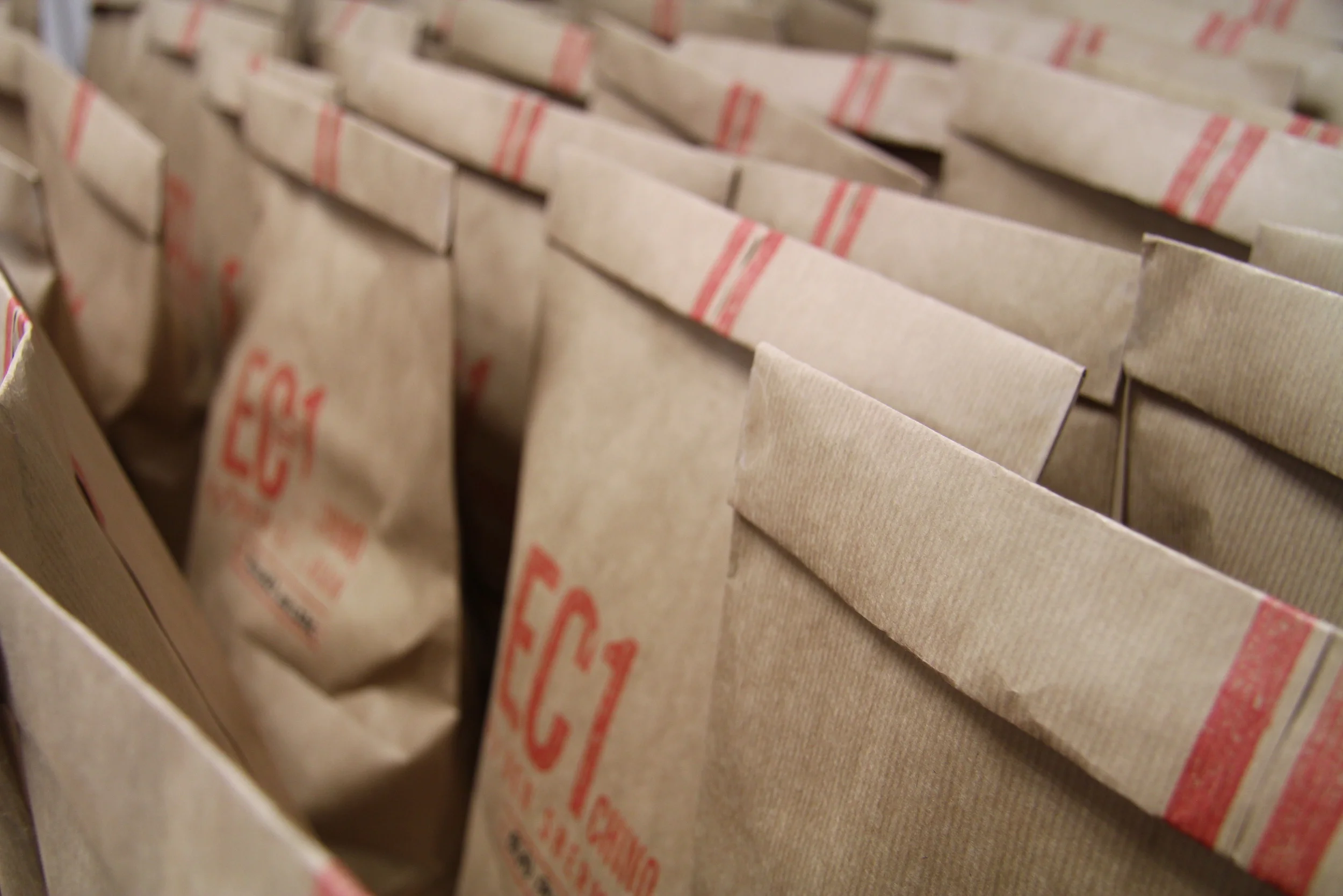
This was a project with two aims. Firstly the new EC1 Chino range needed promoting, and secondly we wanted to get the right customer to visit the new concept stores in London, to raise brand awareness within the target audience.
As Ben sherman is based in Clerkenwell, London, which is where the EC1 got its name ( from the area postcode ), we decided to send a pair of chinos in a brown paper lunch-style bag, to creatives and opinion-formers in the area. There was no catch, simply an invite to one of our London stores to be able to exchange the chinos for a more suitable size, colour or fit, if the ones we sent were not correct.
We stamped the bags manually, and wrote the recipient’s name on the bag. The card inside the package contained the Call To Action and an incentive to shop further.
To mark the 50th anniversary of Ben Sherman, a book was commissioned.
The book celebrated not only Ben Sherman, but 50 Years of British Style Culture.
I was tasked with writing copy for the foreword and to art direct and edit the contents, so that it was tonally on-brand.
A third range which I named DUKE STREET FOUNDRY ( Duke Street was the address in Brighton of Ben Sherman’s first store) was the heritage range.
This was a tiny collection of 10 pieces, all made in England, and all of a style that would have been worn in 1963, the date of Ben Sherman’s founding.
A dark ‘Racing Green’ was chosen as a less obvious ‘British’ motif. I retained the buton in the form of a generous deboss.
A supporting marque was required to use as a badge on certain clothing and products where the main Ben Sherman logo would not be appropriate.
The Shirt Bar was the focal point of the store and designed to bring focus back to the core competency, which is shirts. A unique concept based on the idea of a ‘shirt-deli’, I wanted this hosted by special members of staff, fully knowledgable in everything to do with shirts, and whom I called the “The Shirteliers”. The Shirt Bar was to be their domain.
The Ben Sherman Apparel Design Team had created 4 styles of perfect white shirt. They asked me to come up with a name and concept to allow them to be promoted as more of a micro-capsule range. Otherwise they could disappear as they get absorbed into the larger collection.
I named it the White Shirt Refinery.
From there I came up with an ongoing seasonal strategy to 'Refine' other product groups seasonally, such as the 'Polo Refinery' or the 'Perfect Knit Refinery' .
This eventually inspired the Gingham Shirt Factory initiative.
Ben Sherman launched a brand new division aimed at the higher fashion, more directional end of the market, to sit alongside their more core ‘Script’ range.
I named it PLECTRUM ( which is also known as a guitar pick ) to celebrate the 5 decades of affinity the brand enjoyed with British music culture.
The look of this collection had to appear markedly different to the other ranges. I wanted a clean look in-line with a new global rebrand.
I chose an off-white Tyvek paper, which is ‘un-rippable’. The button was a nod to our button-down shirt foundations.
The package extended across hang-tags, woven labels, printed material and POS.
The site content is being updated. Please return shortly.